iOS Photos ❃
Proposing a more intuitive and streamlined Photos app for millions of iPhone users

Role(s) - Research, UX, UI
Tools - Figma, Illustrator, Photoshop
01. Opportunity
Our phones’ photo management apps serve as our personal archives, holding on to memories from years passed to those captured mere moments ago. Despite countless iOS updates later, the Photos app remains one of the less redesigned parts of the iOS operating system since its initial conception. I believe an opportunity exists to make the archiving of our large amount of media content more nuanced, the filtering process more straightforward, and the general photo management experience more intuitive overall.
02. Research + Redesigns
Due to Photos being an application I’ve spent countless hours on over the years, it was critical when undertaking this project that I check my assumptions at the door. I interviewed just over a dozen friends, family, and colleagues - ranging from professional photographers to those that use their gallery app as a means to store their memes.
Afterwards, I scoured the depths of the internet to see what people have said about their use of Photos, from Reddit forums to comments left on YouTube tutorials.

Before jumping into the redesigns from the initial round of research, I made a list of all the identified areas for improvement, as well as the wishes, in order to establish the project’s priorities. I did this by:
Ranking the frequency in which the same pain points came up
Factored in how much friction the existing design causes to current user flows
From this process, I established the high, medium, and low priorities that I could take on.
A. Period-Based Filter
“I’m able to use it by identifying the time periods of my travels - so since I was in Brazil in December of 2020 for example, I know how far to filter based on that.”


On the main ‘Library’ page that hosts all our media, users have the ability to filter through all their content based on the time periods in which they were saved to their phones.
The challenges with this existing method of filtering are that it requires the user to associate an approximate date with the media they are looking for, and then asks the user to make a second decision that falls into a filtering system with precise definitions (i.e. Months versus Years).
An almost identical second feature exists that allows users to zoom in and out using pinch zooming, varying the amount of media content displayed per row. This zoom feature then appears in yet another place when opening the dot menu in the top right corner.


Since the dates in the top left corner adjust based on the zoom level, my initial hunch was that the time-based filter at the bottom could be gone all together to make use of the already built-in pinch zoom capabilities.
It then became apparent that while they are increasingly becoming the norm, gestural zoom controls are not nearly as discoverable as features otherwise accessed through buttons or inherent to the current display. So, it was time to go back to the drawing board.

Some other options that were explored included:
Option A: Changing the layout border of the page so that incomplete pieces of content were displayed around the page to suggest there was more content to zoom in and out of;
Option B: Introducing a sliding scale that would vary the amount of content displayed at once;
Option C: Introducing a simple ‘+/-’ toggle that also zooms in and out and changes the level of content displayed.
If we take a step back, the core aim of all these features is to provide users with an expedited way at arriving at past content and changing the amount of content displayed on screen at once.


So, based on the value of having a visible and dedicated button for the feature, wanting to simplify the feed, and an ability to hop on already existing user mental models of zooming in and out, the proposal makes use of a more intuitive zoom button that toggles between varying amounts of content that are displayed at once, maintaining the ability of users to move from 1 thumbnail per row to 30.
Ultimately, the proposed redesign of the zoom-based filter:
Simplifies the display levels without needing to connect content to specific time periods;
Allows for more gradation of zooming in and out that is not restricted to time periods;
Streamlines duplicate filtering functions while simultaneously simplifying the appearance of the main library page.
(Note: other features nested in the existing dot menu icon like maps and filters are addressed elsewhere in the proposal).
B. Visual Spacing


When viewing our content at sufficiently zoomed out levels, the continuity of (potentially) thousands of thumbnails may make it difficult to pinpoint where on the screen to look, even if users know what they’re looking for.
Instead, the proposed redesign introduces additional white space between the examined time periods in order to create visual breaks, providing a momentary pause that makes content more digestible. This also avoids the need to hide images in service of creating a ‘filled out’ even stream of content that the app currently adopts.
∴ White space ➝ improved scannability.
C. Similar Content
“I don’t deal with all those duplicate photos, and it’s a problem…if we leave [them all] there, they’ll soon clutter the photo library, making it hard for us to find what we want.”


Throughout the research process, it became clear that users typically fell into one of two categories:
Those that took as a few photos as possible;
Those that took as many photos as needed to get just the right shot.
Amongst those in the latter group, a repeated point of frustration was what on earth to do with all those near identical photos that were either taken or sent to them that often differ ever so slightly.
To mitigate this, the proposal makes use of an added feature that allows users to manually group near identical content on their feeds directly.

Two options were explored for how to group similar content together in mini content groups:
Option A: Leveraging Apple’s machine learning capabilities to automatically group near identical content together;
Option B: Introducing a feature to group near identical content together manually.
Though I initially gravitated towards the automatic grouping, I ended up opting against it for a few reasons:
I had some skepticism about Apple’s current machine learning capabilities to pick up common elements across photos and and simultaneously scan entire photos and identify direct overlaps;
I questioned what ‘near identical’ means for different users - one user may view the exact same photos being captured at two different zoom levels as being warranting of grouping, while another may view them as entirely separate pieces of media.


To rectify all of this, it seemed like introducing this grouping as a manual feature that avoided the pitfalls of the automatic one, while also providing agency to users, seemed like the best way to move forward.
The group's cover image is automatically selected for the user, with the ability to choose their favourite one to be displayed on their main feed. Making use of the setup of the already built-in burst photo capabilities would allow direct side by side comparison between these similar pieces of content and for unwanted images to be easily compared and deleted.
Designer Tony Jin proposes this exact phenomena in his ‘Google Photos’ redesign; learn more about his case study here.
D. Adding Content to Albums
“I struggle with Apple’s albums. It takes such a long time to organize everything into the right place that I just don’t end up doing it.”


The challenge with the current mode of organizing content into albums is that it is tedious; it requires users to press the icon in the bottom left corner, scroll down, click on Add to Album, and then scroll down again before selecting which album they’d like their content to be added to. You can imagine having to do this over and over again may be tiresome, and seems to lead some users to forfeiting the process entirely.

I knew that a simple bringing forward of the ‘Add to Album’ icon would go a long way in making organizing content into albums that much more straightforward and efficient, so the question was how it was going to be presented. I explored integrating it on the main function bar, including it in the upper zone, and overlaying over it over the piece of content itself.
A round of A/B testing revealed that users were able to locate and use the icon in each of its respective placements eventually, but though users generally arrived at the first option more quickly than the others.
This could be based off of existing user habits of currently needing to select the icon at the bottom left, or that the existing bottom functions naturally lend themselves to these kinds of functional tasks.


Secondly, the proposal aims to shorten the time required to assign a piece of content to its intended album by minimizing the oversized New Album button, and by decreasing the size of the album thumbnails to display more of the available options at once.
Though it may not seem like much, sometimes having to press one less button (and arriving at your intended destination a tiny bit faster) makes all the difference!
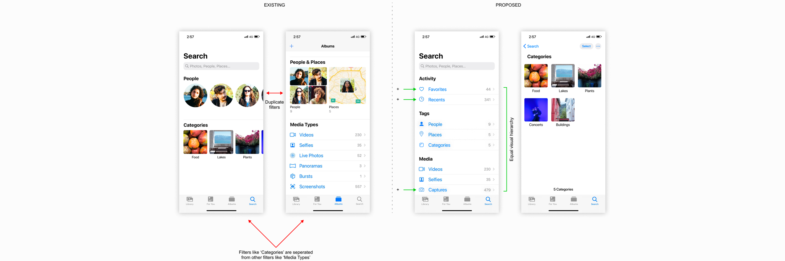
E. Searching by filters
“Any time I am trying to find some photo I took myself, I can’t find it as they are lost in hundreds of saved photos from online apps like Reddit.”


Depending on how much content we’ve acquired over the years, the act of going back and searching for an image can be a surprisingly large undertaking. Despite the powerful AI-driven Search function, the experience of manually searching for a piece of content could be notably improved by:
Consolidating filters tucked underneath Albums with the filters on Search, creating one centralized place to filter through all content;
Adopting an even visual layout to flatten the hierarchy of the different types of filters;
Leveraging existing metadata to reintroduce an ability to filter through captured images;
Adding Favorites and Recents filters to the Search page as well to reinforce this consolidated search part of the application.
F. Tags
“The ‘People’ part of the filters is great but I hate how it misses some faces and gets it wrong sometimes.”


Overnight as our iPhones are plugged in and connected to the wifi, Apple’s machine learning will recognize people’s faces and complete the tagging process for us automatically.
Though, what happens when a blurry photo, poor lighting, or any myriad of reasons prevents our phones’ AI from successfully recognizing and tagging someone? As it stands, one of the most glaring omissions of the application is the ability to manually tag people that weren’t automatically captured by machine learning.
In service of better categorizing our content and being able to track it down later, the proposal introduces a feature that allows users to manually tag people in photos.


Using this logic, the project also proposes leveraging the already existing caption feature into a way of categorizing our content, which can then be filtered through in the centralized search tab under Categories at a later time. The end result of using it as a category is that it can simultaneously serve as a caption and a searchable tag.
03. Reflection
This was the first redesign I worked on for a digital product with such a massive user base (which also meant a massive amount of potential different user needs desires). The biggest ongoing consideration throughout this process was how to better the existing experience while minimizing the introduction of new features to the app.
Speaking to users and pulling people’s wishes from all over the internet meant there was an exhaustive list of unmet desires that were considered but not used in the case study (like creating shared albums with other iOS users, having password-locked albums, et cetera).
I believe experiences that try to be everything for everyone rarely end up satiating the needs of anyone well (especially when going into feature-overdrive). I did my best to take on redesigns that I felt maximized making parts of the app as intuitive as possible while simultaneously minimizing disruption to existing user paradigms.