Alma Mater Society ♜
Re-conceptualizing how a university student union connects to its students

Collaborator - Ava Nasiri
Role(s) - Research, UX, Visual Design
Tools - Figma, Illustrator, Photoshop
01. Opportunity
Canadian university student unions are a world unto themselves. From lobbying the government for more affordable transit passes to throwing an annual stadium-level block party for its 50,000+ students, the AMS is the official elected representation of students at the University of British Columbia (UBC) to their university administration, as well as to the provincial and federal governments.
Due to how vast and varied the organization’s offerings are, it has historically been difficult communicating to students what exactly the AMS does on their behalf, as well as the areas of a UBC student’s experience that are shaped by the society. So, an opportunity exists to re-conceive the AMS website by presenting its various offerings in a way that is more relevant to its student constituents, while simultaneously lowering the barrier to engaging with those offerings.
Note: The AMS website that was used as a reference for this case study has since been overhauled. You can browse the most recent version of the AMS website here.
02. Student Survey

As part of a larger organizational review, a survey was sent out to the entire student population to gauge what their understanding of the AMS was, as well as how highly they valued and prioritized its different offerings.
From the just over 400 responses, there were a number of takeaways (and surprises) that went on to shape this proposal:
Students’ understanding of the AMS seemed to be influenced by its internal organizational chart, likely since public communication has historically been carried out that way;
Students knew certain services and offerings existed on campus to serve them in a number of areas, though many could not pinpoint what these services were called or where on campus to go to access said services.
03. Information Architecture
The AMS has always been an organization that communicates from the inside out, and the website is no exception - the IA is structured around nesting offerings in four large bucket categories - ‘Services’, ‘The Nest’ (building), ‘Getting Involved’, and ‘Events’.
While this architecture helps group the AMS’ offerings in line with how the organization sees itself internally, these categories don’t actually give students who are less knowledgeable an idea of the tangible offerings available to them - the oversimplified IA has proven to cause confusion instead of provide clarification. So, some alternatives were considered:
Option A - By theme
The first considered option aimed to filter through the AMS’ offerings by the themes of support they exist in (i.e. a tutoring service would fall under ‘Academics’).
However, some user tests with past UBC students revealed there was some friction figuring out which theme a particular service belonged to, especially if a user already knew the name of the service they wanted to access.
Option B - By touchpoint
The second option aimed to filter through by all the actionable touchpoints between students and the AMS (i.e. a tutoring service would fall under ‘Services’).
From the user tests, this strategy appeared to be the most immediate in helping users arrive at their intended destination. So, Option B was chosen and a filter was added to navigate through the AMS’ offerings via the touchpoints that students typically seek out.
04. The Website
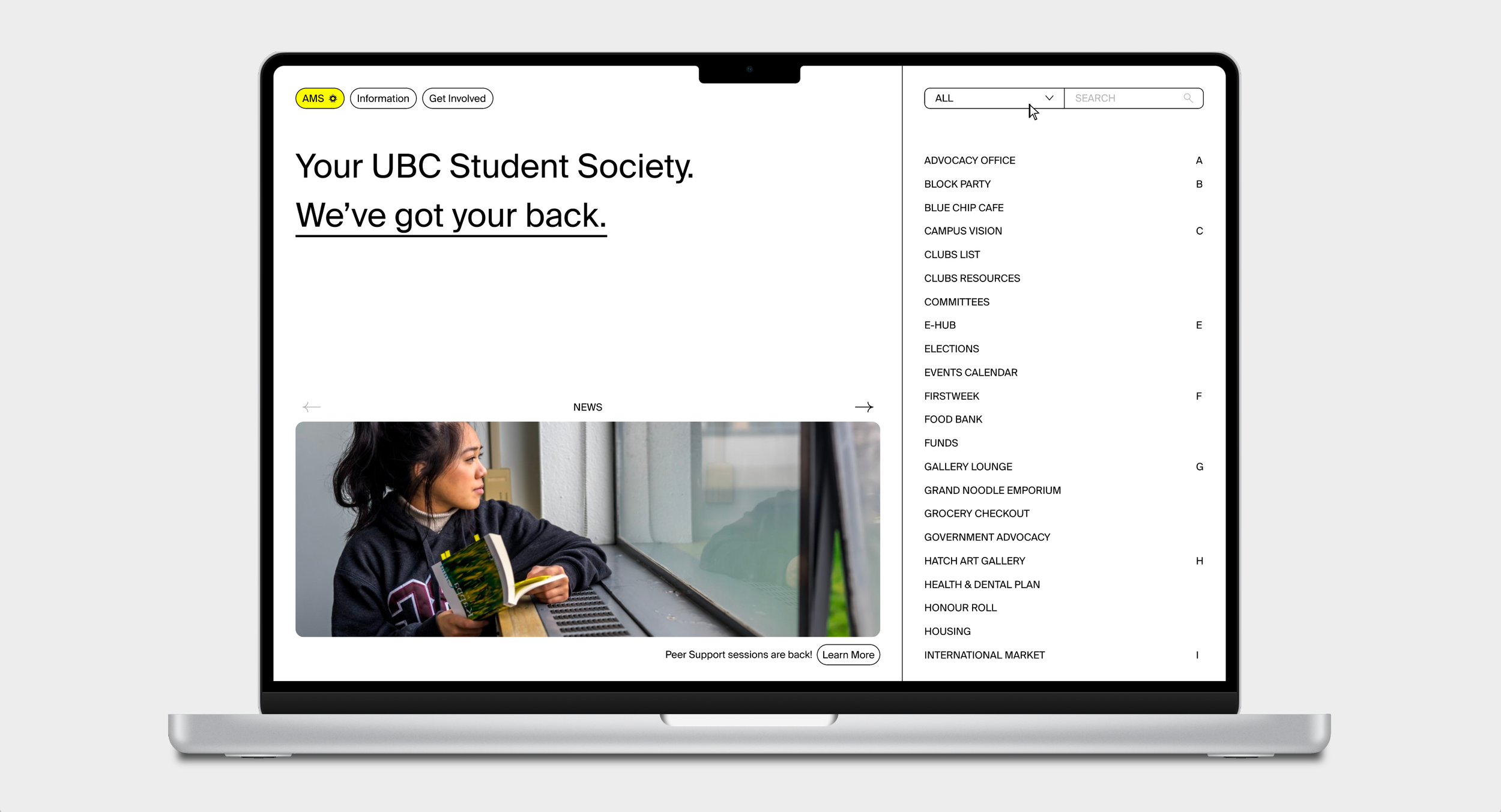
After determining how the AMS’ offering would be filtered through, the landing page was calibrated to serve students with different levels of knowledge about their society:
Filters - Since navigating university offerings can be an overwhelming and complicated task, the touchpoints make clear the exact areas that students can receive support through the AMS;
Alphabetical guide - With 40+ current offerings and a list that grows each year, the guide provides a faster experience to scroll through the offerings for users with a target in mind;
Full offerings list - The proposal avoids nesting offerings and instead brings them all to the front for any level of knowledge of the AMS;
Search bar - Allows for students to either look up particular offerings or search through relevant tags (i.e. ‘Counseling’ would redirect the user to ‘Peer Support’).
The website’s visuals had to accommodate a lot of different, and even contradictory, user moods and experiences (like serving as a touchpoint for a student seeking immediate wellbeing support, while simultaneously providing information about the end-of-year Block Party). As such, the proposal aims to strip back the website into a neutral canvas, where the visual language can then be appropriated to fit different moods and experiences through images, colour, and tones for each respective offering page.

05. Reflection
When thinking of the full student experience and what it means to seek out support on a university campus, one of the most glaring roadblocks for the website was the institutional division between university offerings and the student society-operated ones. For example, both institutions provide closely-related entrepreneurship support services for students, but organizational hardlines means that each institution publicly communicates only the support services that itself operates.
Ideally, a website would serve as a centralized touchpoint for all support services and offerings available to students at UBC, irrespective of the operating body in charge. While not a complete replacement, the proposal provides a link to external resources that are not operated by the AMS that may be of relevance to users. Though the AMS and university relationship operates in a particular dynamic in this context, my hunch is these kinds of bureaucratic constraints have and will continue to play formative roles in shaping the kind of work we do as digital experience designers.


